On this page
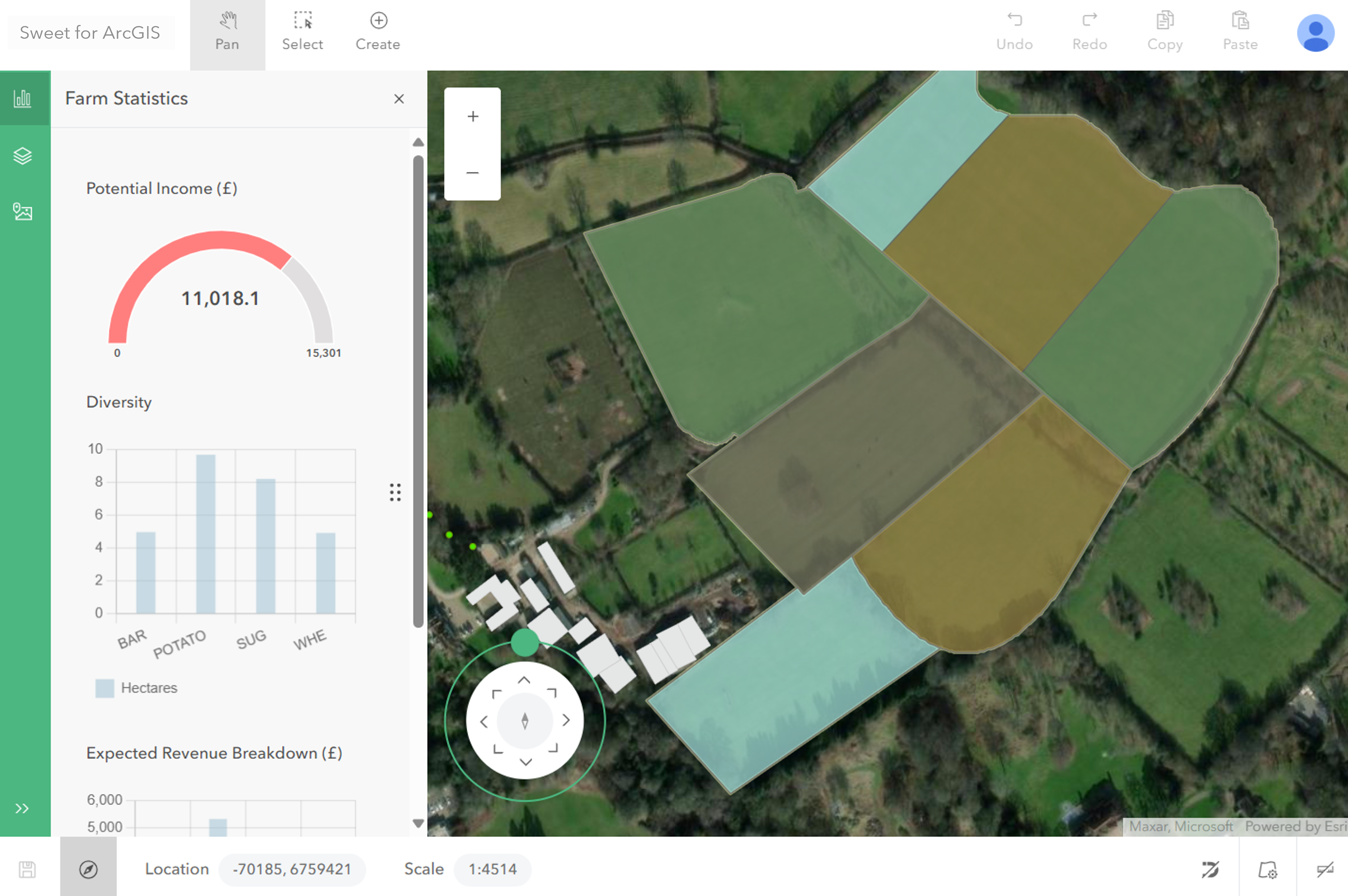
A Sweet application can be customised with its own left or right hand panels. Custom panels act as containers in which charts, commands and content can be added. Custom panels allow for application specific workflows and behaviours to be set up.
Why add a custom panel
There are many benefits from using custom panels in an application:
- Charts
Provide insight into the data and edits a user is making. For example they can show impact analysis, before and after qualifications and other relevant information to the task in hand. - Commands
Provide a mechanism by which apps can encode workflows and advanced tools. Commands can change data and the behaviour of the application. - Content
Provides a means of embedding any html on a panel. This provides complete flexibility on presenting information to the user.
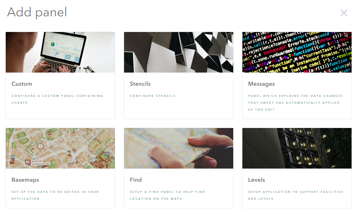
Adding a custom panel
Custom panels can be added to the left or right hand side of the application.
Left-hand panels will appear in the left sidebar. Right-hand panels are usually for transitory content. A menu item can optionally be added to the user menu to open a right-hand panel. Alternatively a command elsewhere in the application can be used to open the custom panel.
Adding a left-hand custom panel
- Switch to the wireframe view of the application.
- Click the New Panel (large +) button to the left of the map area.
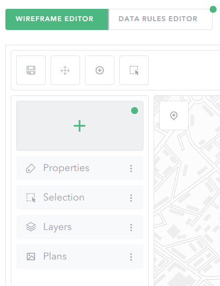
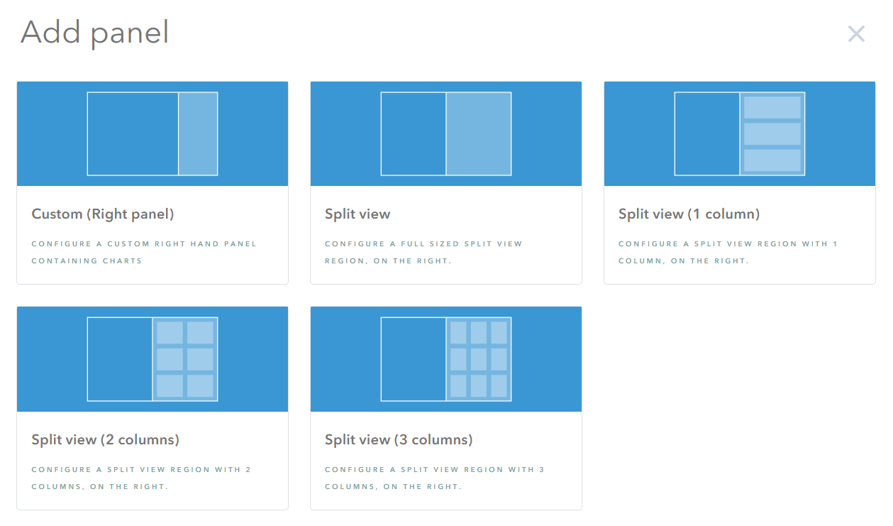
- Choose Custom, in the pop-up dialogue.
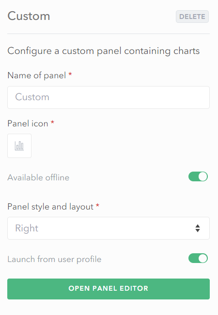
- Provide the new panel with a Name and Icon.
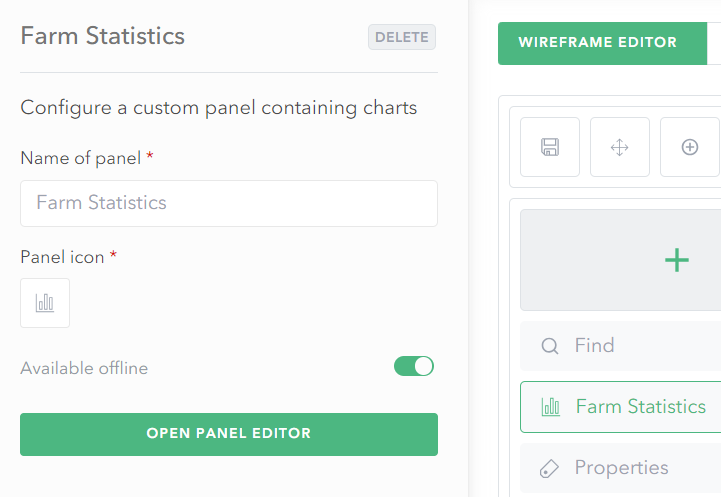
- Choose Open Panel Editor to begin adding charts and commands to the custom panel.
Adding a right-hand custom panel
- Switch to the wireframe view of the application.
- In the right-top corner of the map, use the chevron to open the right-hand panel list.
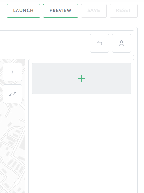
- Click the New Panel (large +) button to choose the type of right hand panel to add.
- Use Custom for a standard right hand panel. Alternatively use a split view layout.
- In the panel properties, choose whether to add a menu item for the panel on the user profile menu.
Adding a chart
Charts provide insight into the data being viewed or edited in the map. With custom panels, it is possible to add gauges, bar, pie, donut, radar and line charts.
To add a chart it is necessary to open the Panel Editor and to add the required chart.
With a chart, it is necessary to configure the chart’s data source and appearance.
- Open the Panel Editor.
- Choose the Add New option.
- Choose the type of chart item on the Add element dialogue.
- In the settings on the left, provide a Title for the chart.
Please see below for further details on the type of charts available and how to configure their data source, appearance, refresh settings, and no data behaviour.
Please see configuring a data source for charts and tables for an explanation on how to use a script to provide the data for a table or chart.
Refreshing the data in a chart
By default, charts will automatically be refreshed if the data source references application wide variables such as session state, the current map extent, selection or similar properties.
In addition it is possible to set the chart to be refreshed if data changes in particular layers. The layers must be watched for this automatic refresh to happen. If a layer is not watched, the chart may show out of date information, if the user edits data in the layers the chart is based on.
No data
If the chart’s data source returns null, the chart can be hidden, or a message shown in its place.
This is configured in the No data section.
Gauge
Gauges provide a visual means of seeing a min, max and current value.
The data source for a gauge is different to other types of charts. It is necessary to return a dictionary, with, min, max, and value properties.
For example, the following script calculates these values:
//Filter crops in the map which do not have the type of none
var cropLayer = Filter(FeatureSetByName($map,"Crops"), "Type<>'NONE'");

/*The most revenue generating crop is 550 per hectare.
This calculation works out the maximum revenue that could be generated
by this land*/
var maxincome = Round(Sum(cropLayer,'UsableLand') * 550,2);

/*This calculation works out the income potential when all crops are
added together based on the crop type selected*/
var actualincome = Round(Sum(cropLayer,'IncomePotential'),2);

/* This type of feedback requires a dictionary to be returned
which is the following; min, max and value.
These can be populated by calculations like
those made above, by fields in the data or hardcoding the values. */
return Dictionary("min",0, "max", maxincome, "value", actualincome)
With a gauge it is possible to set the colour of the gauge itself. It is also possible to use a colour scheme, and have the application automatically choose an appropriate colour.
Bar chart
A bar chart presents data with rectangular bars, the length proportional to the value.
It is possible to have a grouped bar chart by setting the Number of datasets property to a value greater than 1.
For each dataset to be shown in the bar chart, it is necessary to provide a Value field and Label as well set the colours to be used for the bar itself. Alternatively if using a colour scheme, these will automatically be set.
Line chart
The line chart is configured using a similar set of properties to a bar chart. It can show multiple datasets on the chart at once if configured to have more than one dataset.
With the line chart, it is necessary to set the the line colour, and point colour properties. Alternatively if using a colour scheme, these will automatically be set.
Pie, donut and polar area charts
These are all similar types of chart, and have similar configuration. A pie and donut chart shows the relationship of parts of the data to a whole. The polar area chart differs to pie and donut charts by changing how far each sector extends from the centre of the chart.
With these types of charts it is necessary to provide the following:
- Label series field required
The field in the data source that should be used for labelling. - Value series field required
The field in the data source that should be used for the value/quantity. - Colour series field optional
An optional field that can be used to specify the colour for a particular segment based on the data. If not set, the colour scheme will be used to randomly assign a colour.
Adding a command
Commands are operations the user triggers in the application. There are three different types of commands:
- Simple button
A button with a name and a description that the user can click on.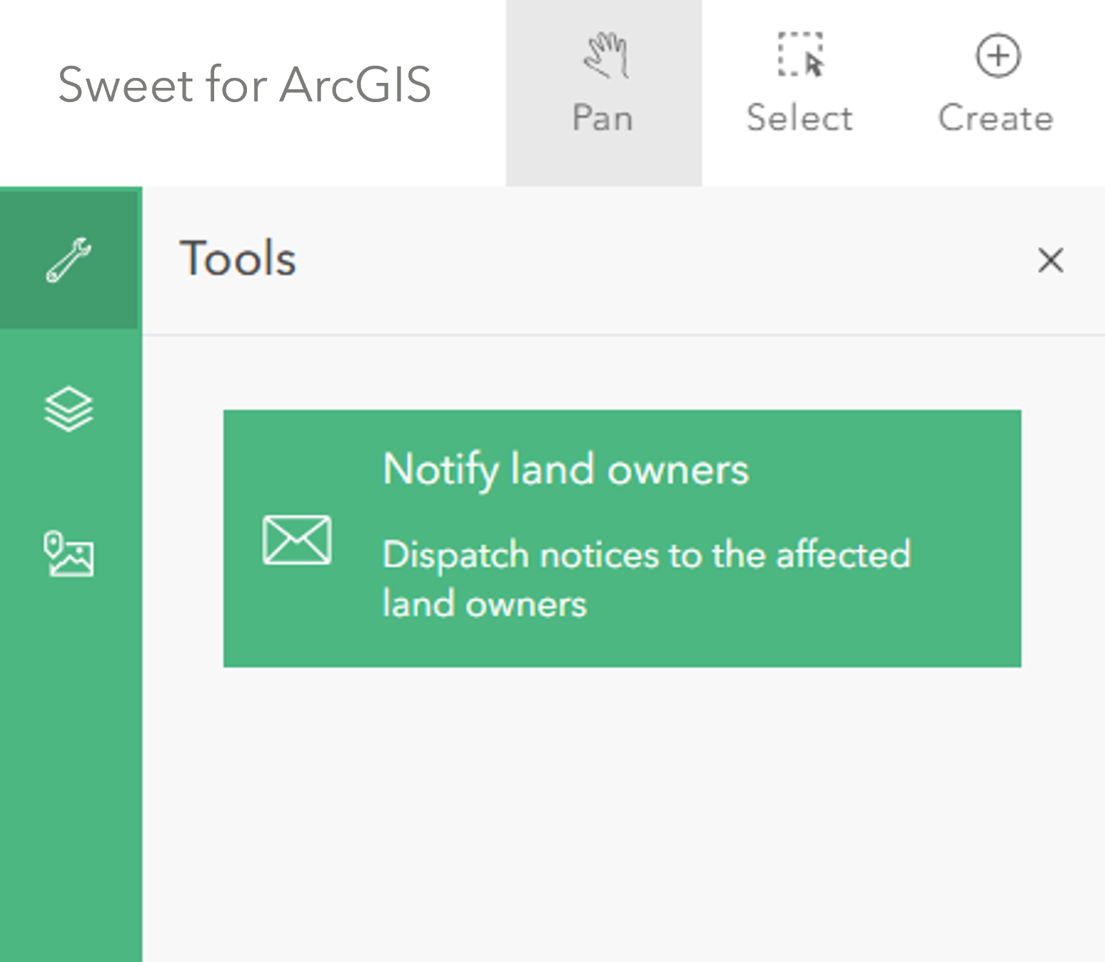
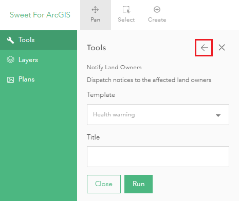
- Form
A form in which the user can enter values. Once the values are either entered or changed, the command will run. It can be configured that the command will run when the values are changed or if the user clicks a Run button. Please note that for Mandatory Form Parameters, it is recommended to use a suitable label (such as (*) or (Mandatory)) to notify the end user of the mandatory nature. These labels can be set in the Builder under Form parameters > Edit variable.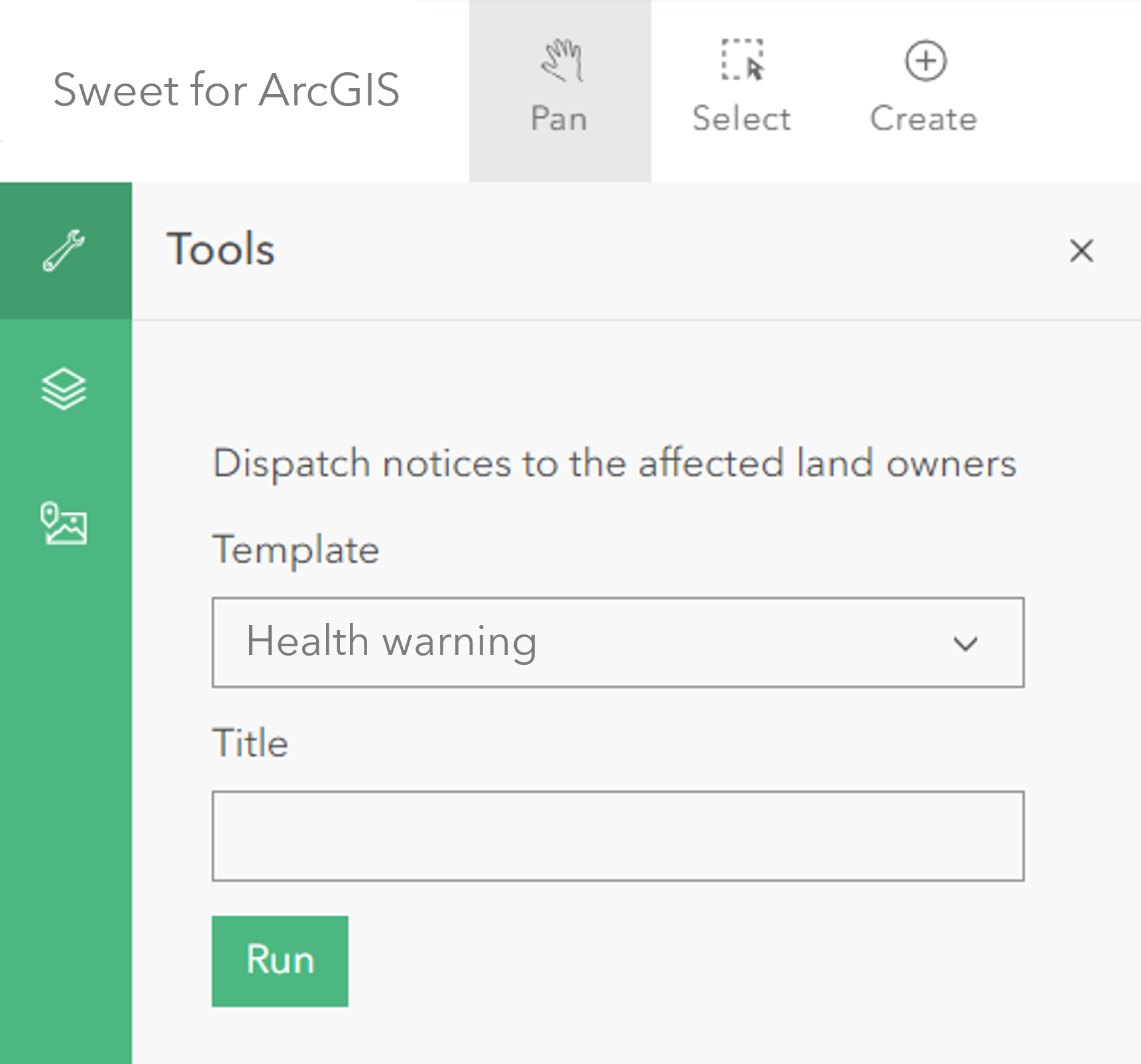
- Dialog
This is similar to the form style. The difference is that the user will select the command and then be asked on a separate page to fill in the parameters and run the command.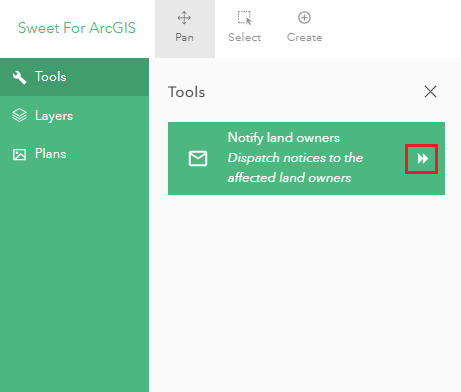
With commands, an Enabled script must be provided that determines if the command is currently enabled in the application. This means that buttons can be disabled based on what is selected or where the user is viewing in the map.
Adding a new command
- Open the Panel Editor.
- Choose the Add New option.
- Choose the Command item on the Add element dialogue.
- Find the Appearance section of the new command and provide a Name and Icon for the command.
- Choose the type of command. This can be Button, Form or Dialog.
Please refer to the sub-sections below for configuring the commands enabled state, and the execution tasks it should run.
Determining if the command is enabled
Provide a script to define when the action should be available. The script should return a boolean, where true indicates the action is enabled, false indicates the action is disabled. If the value hide is returned, then the command will be hidden.
Task execution
When the command is run, it will perform a sequence of tasks. All the tasks will run as a single operation.
Please refer to the Execution tasks section under Developers to better understand what tasks a command can run.
Adding a progress message
Within commands, users can also generate messages to the user that will show the progress of custom analysis performed when making edits. This is useful when performing large and time-consuming analyses. These messages by default will appear below the command being run within the panel.
Messages can be produced for the functions voronoi, kmeans, and regiongrow, and can also be used to show the progress of a grid output.
To add a message, use the progress function in Arcade. Examples are shown below:
- voronoi message
// Preset some messages, for the voronoi function progress({"%voronoi%:readingdata": "Reading Data", "%voronoi%:calculating" : "Generating Data", "%voronoi%:writing" : "Writing Data", }); - kmeans message
// Prepare some messages for the kmeans clustering function progress({"%kmeans%:readingdata": "Reading Data", "%kmeans%:solving": "Finding Clusters", "%kmeans%:writing" : "Checking Clusters" }); - regiongrow message
// Prepare some output messages, for when the region grow operation runs. progress({"%regiongrow%:readingseeds": "Reading Seeds}", "%regiongrow%:readinggeog" : "Reading Data", "%regiongrow%:growing" : "Generating Data", "%regiongrow%:union" : "Merging Data", "%regiongrow%:writing" : "Writing Data", }); - Grid message
 //Generate a grid based on the sub-compartment feature extent, and report it's progress
 progress({ "%grid%:buildinggrid": "Making cells"});
  var grd = grid(polygon(geom), cellSize);
Adding a table
Tables provide a flexible means of viewing data in an application. Custom panels support the viewing, paging and refreshing of tabular data.
Adding a new table
- Open the Panel Editor.
- Choose the Add New option.
- Choose the Table item on the Add element dialogue.
- In the settings on the left, provide a Title for the table.
Once a table has been added, it is necessary to provide a data source for the table, configure its appearance and when it should be refreshed. It is further possible to define what should happen if there is no table data as well as row-level commands that the user can run.
Please see configuring a data source for charts and tables for an explanation on how to use a script to provide the data for a table or chart.
Configuring the appearance of a table
The data source provides the source data for a table. However for the table to be displayed it is necessary to add columns and aliases.
Columns and aliases are the fields to show in the table. Each column must be added, given a label (the column name), and a source field.
Depending on the complexity of the data source, the Field may not list all available fields. It is possible to just type the name of the field in the data source, rather than select it from the list.
In addition to deciding which columns to show in the table, it is possible to set the number of rows to be displayed. The data will be paged, allowing the user to step through the data.
It is possible to configure if the table will highlight features on the map, when the user hovers over the data rows. There is also an option to set whether the viewing page should be preserved if the data is refreshed.
Refreshing the data in the table
By default, tables will automatically be refreshed if they reference application wide variables such as session state, the current map extent, selection and similar.
In addition it is possible to set the table to be refreshed if data changes in particular layers. These layers must be configured to be watched. If this is not set, the table may show out of date information, if the user edits data in the layers the table is based on.
No data
If the table data source returns null, the table can be hidden or a message shown in its place.
This is configured in the No data section.
Actions
It is possible to configure row level actions. Actions are like custom commands.
When actions are configured, a drop down menu will appear on each row of the table. This menu will have the commands that can be executed.
Each action/command has a name, icon, and a set of execution tasks.
Please refer to the Execution tasks section under Developers to better understand what tasks a table row action can run.
Adding HTML content
Any html content can be added to a custom panel. This is configured an advanced customisation.
Please refer to the Embedding HTML guide to understand how html content can be added to a panel and the options available.
Data sources for charts and tables
The data source for a chart and/or table is provided as a script. The script should return a FeatureSet.
The following is a simple, filtered, ordered table data source, based on a feature layer in the map.
var tableFeatures = Filter(
  FeaturesetByName($map, "<LAYER NAME>"),
  "STATE='ACTIVE'"
);

// return an ordered FeatureSet.
return OrderBy(tableFeatures, "DATE_SUBMITTED DESC");
For advanced configurations it is possible to completely define a FeatureSet without a data source. This allows complete flexibility to define the rows and columns of a data source.
// Define a FeatureSet using a JSON specification. It is necessary to define the fields
// and features in the FeatureSet.
FeatureSet({
    "layerDefinition": {
        "objectIdField":"FID",
        "geometryType": "esriGeometryPolygon",
        "fields": [
                    {"name": "FID", "alias":"FID", "type":"esriFieldTypeOid" },
                    {"name": "message", "alias":"message", "type":"esriFieldTypeString" }
                ]
        },
        "featureset": {
            "features": [
                    Feature(null, "FID", 1, "message", "Hello World"),
                    Feature(null, "FID", 2, "message", "Hello")
                        ]
            }
    });